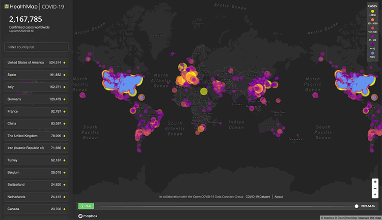
Coronavirus maps have taken over the internet. Hundreds of mesmerizing color-coded maps plotting the spread of the disease have appeared from reputable academic, media, and government sources, as well as from hackers trying to steal your data. They harken back to John Snow’s famous maps of the 1864 cholera outbreak in London, which demonstrated the origins of the outbreak in the city’s shared water pumps.
 Berkeley Haas Asst. Prof. Abhishek Nagaraj wants everyone to be savvier consumers of these maps—and their biases and distortions—so they can respond in a more nuanced way to the information maps contain. If people can learn to better decode coronavirus infographics, they might make better decisions about where to send badly needed medical aid, where shelter-in-place policies are working to flatten the curve, and where to focus financial assistance for those caught in a historic economic downdraft, he says.
The economics of maps
Nagaraj is a master of maps. In a new study published in the Journal of Economic Perspectives, Nagaraj and co-author Prof. Scott Stern of MIT Sloan School of Business examined the economics of maps, and the ways their simplified descriptions of the world can sometimes mislead readers. “Explicitly or implicitly, mapmakers have an agenda,” says Nagaraj. “And understanding that agenda is very important in using maps in a responsible way.”
Explicitly or implicitly, mapmakers have an agenda. Understanding that agenda is very important in using maps in a responsible way.
For example, Google Maps, Apple Maps, Yelp, and OpenStreetMap each map the world in different ways, depending on their agenda. One study showed that Google tilts heavily toward roads and transit, possibly owing to its tight integration with Uber and Lyft apps, while Apple favors more of the shops and landmarks that its affluent users want. Yelp can inadvertently leave as many as 40% of businesses in some states off its map, often due to their small size or rural location, which can lower restaurant revenues for those missed by as much as 12%, Nagaraj found in a separate ongoing study. OpenStreetMap excels at open-source projects like mapping refugee camps and disaster zones, which can be much less visible on other maps. Each set of circumstances and interests can lead to maps that can have profound economic implications for the businesses and individuals literally put on, or left off, the map.
Nagaraj’s study appeared in February, just as the coronavirus crisis was beginning to accelerate in the U.S., so it did not address the pandemic. But the Berkeley researcher is now hard at work updating his analysis with an examination of the maps of the coronavirus era for their latent economic and social meanings. He finds that coronavirus maps often have predictable biases and distortions, which often involve subtle data and design choices. By asking a series of questions, consumers of these maps can become more knowledgeable interpreters of their insights.
Has the data been adjusted?
A map showing absolute numbers of coronavirus infections or deaths inherently highlights heavily populated areas. “If you plot any activity on a map, you will basically see more activity where there are more people,” explains Nagaraj.
If you plot any activity on a map, you will basically see more activity where there are more people.
Populated areas along the coasts and in major metropolitan areas in large countries such as the U.S. will be over- or underrepresented visually in maps, depending on how they are depicted. “People don’t realize that human beings are super-concentrated on the surface of the earth,” he says. Millions of people crowd together in a relatively tiny area of New York City that can be difficult to see in great detail on a large U.S. map, while vast areas of the U.S. have few inhabitants but can appear prominently.
Increasingly, better maps of the coronavirus pandemic adjust for population size. That means they divide the absolute number of cases by the number of people in an area, with a unit such as “cases per 100,000 people.” And they use color shadings with breakpoints that don’t distort the geographic incidence of infection. These techniques provide an apples-to-apples comparison when looking across areas of a map.
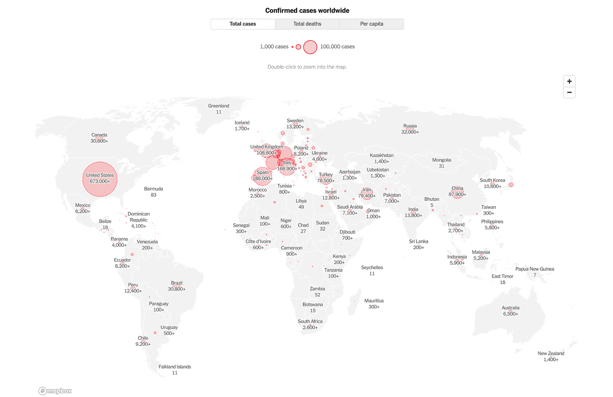
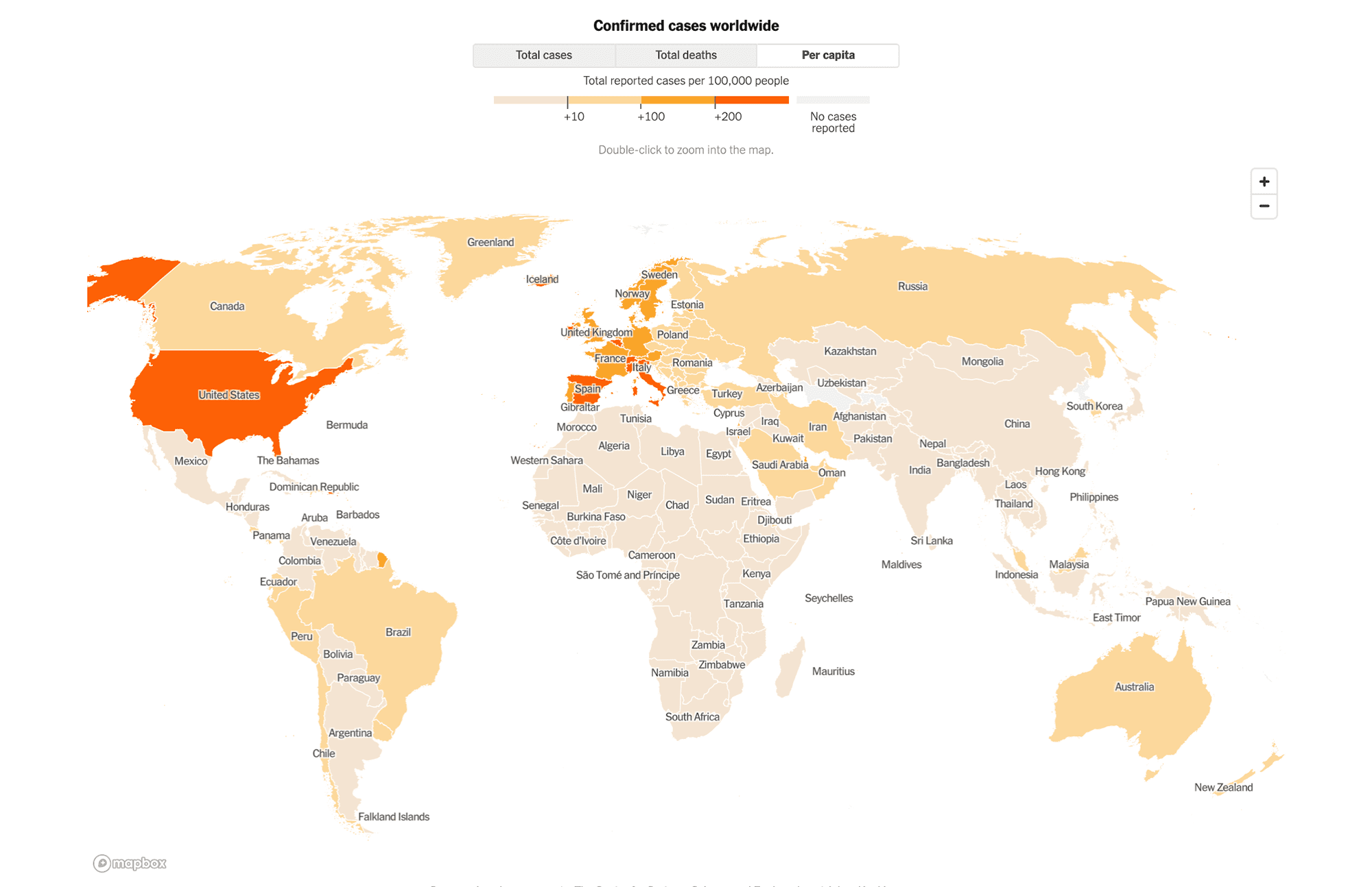
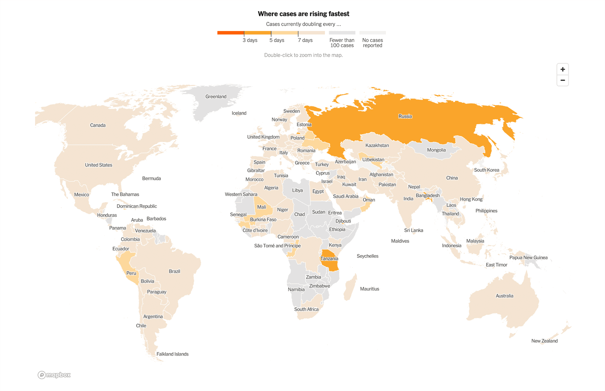
These screenshots of maps taken from The New York Times’ “Coronavirus Map: Tracking the Global Outbreak”, as of April 17, 2020, show how absolute numbers can subtly mislead.
Not adjusted for population: This example displays total coronavirus cases, with scattered and often heavily overlapping bubbles that can highlight areas with large populations, but obscure areas where the outbreak was most concentrated.
Adjusted for population: After adjusting the number of cases by the population of each country and using an accurate color scheme, it becomes clear that the biggest hotspots in mid-April were no longer in China, but rather in Italy, Spain, Switzerland, Belgium, and Iceland in Europe, and to a lesser degree in the United States. However, this country-level view misses regional hotspots such as New York.
Adjusted for growth rate: Looking at this map adjusted for rates of growth, the story changes again, highlighting areas where the virus was spreading the fastest, including Bangladesh, Russia, and Tanzania.
How detailed is the data?
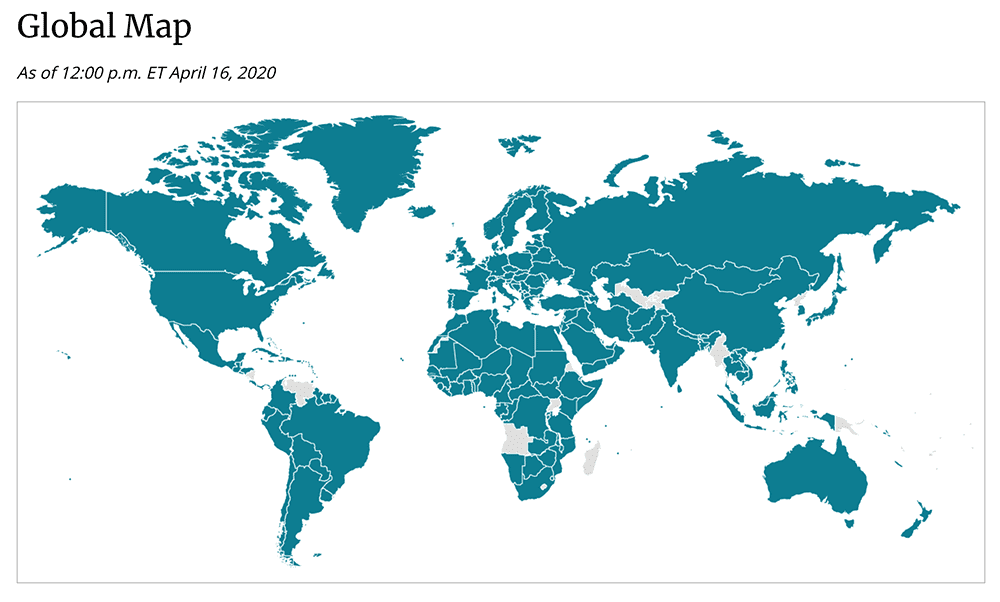
Data can be shown at many levels of detail. Often, available data about the coronavirus pandemic has been limited to relatively large geographic units such as countries, states, and counties. That choice can lead to overgeneralizations, and even mischaracterizations of the trends. The CDC’s world map (below), for example, makes it look as if the entire world were infected to the same degree.
Another common issue is that less-populated states and counties that occupy relatively larger geographic areas can also appear much more prominently on a map, especially in large countries like the U.S. and Australia and in large Western states in the U.S. where the population is highly concentrated in cities. Color coding can further exaggerate these differences. “On a map, your eyes will tend to be drawn toward the larger regions,” says Nagaraj. “Some of the larger regions are precisely the ones that are the least interesting, because a lot of people don’t live there.”
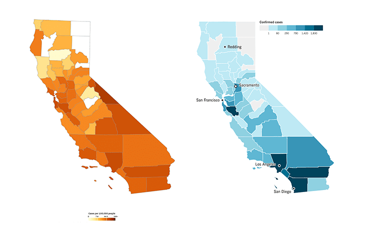
An example is these maps showing Covid-19 cases in California counties, as of April 17.
While helpfully adjusted for population, the map on the left, from the San Francisco Chronicle, has color-coding that visually emphasizes three sparsely populated areas in the east-central portion of the state (Mono, Alpine, and Inyo counties). In fact, a tiny number of coronavirus cases and deaths had occurred there in absolute terms.
The map on the right, from the Los Angeles Times, uses a color-coding scheme that better draws the eye to much bigger hotspots like Santa Clara, Los Angeles, Riverside, and San Diego counties, even though its data is not adjusted for population.
When data is plotted at the level of the city—or even smaller units within cities like towns, precincts, census tracts, zip codes, boroughs, and neighborhoods—the information can elicit much greater insight. Only recently did New York City release zip-code-level information, which led The New York Times to produce maps that related disease incidence rates with income levels. The maps showed that the poorest neighborhoods have much higher rates of infection. The San Francisco Bay Area has been slow in releasing such sub-city-level data. Privacy concerns have been a barrier to releasing much more granular data in the U.S., while areas such as China, South Korea, Italy, Israel, and Singapore have shown much less concern with their tracking of cell-phone location data.
When data sources are mixed, as in some sources like the well-known Johns Hopkins map, city-level data can be overlaid with country-level data. Bubbles showing dense outbreaks can grow too crowded to discern patterns, however. That’s where dynamic data visualizations can help show how the virus has spread and where it has spread most quickly.
What’s the bias in the data?
Data can deceive. Maps such as this New York Times visualization of “Where America Didn’t Stay Home Even as the Coronavirus Spread” are showing drastic changes in movement patterns as people halt all nonessential travel. But those patterns may be inherently biased. According to Nagaraj’s research, many underrepresented populations are “missing from the map.”
Low-income people who live farther from work or a grocery store may need to travel a greater distance than higher-income people who can comfortably shelter at home with their Zoom meetings, high-speed Netflix streams, and stockpiles of food and supplies. “People who need to go to work literally can’t afford to stay at home,” says Nagaraj. “Maps can simplify a lot of complicated stories, and aid measures might miss them if governments rely exclusively on data that does not record them.” For example, data may miss underrepresented minorities or individuals who are not officially on payrolls, because they work in informal sectors of the economy.
Maps can simplify a lot of complicated stories, and aid measures might miss them if governments rely exclusively on data that does not record them.
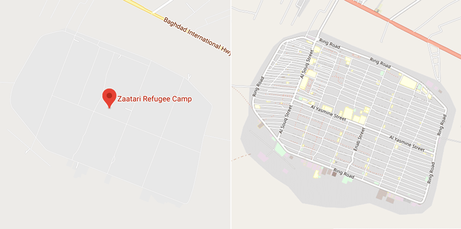
Researchers have found that open-source mapping projects can correct for some of these biases. Nagaraj’s work notes that after the 2010 Haiti earthquake, private companies provided free, high-resolution satellite images that volunteers and experts working with the World Bank could use to map damage to buildings. The availability of low-cost, post-disaster imagery over the last decade has led to cheaper and more timely disaster maps and improved disaster response. This image, for example, below compares maps for the Zaatari Refugee Camp in Jordan on Google Maps (left) compared to OpenStreetMap (right).
We are now starting to see open-source maps better include hidden populations in the coronavirus era, such as the map from UC Berkeley’s Othering and Belonging Institute looking at the relationship between higher air pollution levels and higher numbers of deaths from coronavirus. Berkeley Haas Asst. Prof. Victor Couture and researchers from four other universities recently released an open-source mapping database for academic researchers studying the spread of Covid-19. It helps visualize potential exposure levels based on cell-phone movements at the state and county levels, including visits to commercial venues as well as some income and education information.
Mapping, and remapping, the coronavirus crisis
In the days of John Snow’s 19th-century cholera maps, data was collected manually—point by point, person by person. In today’s age of big data and artificial intelligence, data is collected automatically, in real time, and at a massive scale.
“Now we’re tracking the movement of millions of individuals in a matter of days,” says Nagaraj. “From a mapping perspective, that’s world’s apart from the past. We can provide powerful insights for policymakers that enable actions that weren’t possible before.”