Fewer managers, more tech talent: How early AI investments rewired company org charts
Researchers from Berkeley Haas and four other universities have released a trove of smartphone tracking data in an open-source database—a powerful tool for studying how people are changing their movement patterns and potential exposure levels during the coronavirus pandemic.

The Covid-19 Exposure Indices, created by Berkeley Haas Asst. Prof. Victor Couture and researchers from Yale, Princeton, the University of Chicago, and the University of Pennsylvania in collaboration with location data company PlaceIQ, is aimed at academic investigators studying the spread of the pandemic. The data sets allow researchers to visualize how people can potentially be exposed to those infected with the virus, based on cell-phone movements to and from businesses and other locations where a great deal of the exposure happens.
Couture hopes that researchers may start to find correlations between the disease and certain venues and travel patterns. Looking forward, the data also could be useful in anticipating the movement patterns that predict where future outbreaks could reemerge once restrictions are lifted. “The end goal is to identify how changes in exposure rates within different types of venues and for different demographic groups impact the number of cases,” says Couture.
Couture and his collaborators are the first academics to release open-source smartphone location data. They are part of a much bigger movement of researchers, companies, and institutions making data easily and freely available to study the pandemic. For instance, Apple, Google, Foursquare, and other big companies have also released movement data. Couture hopes that by being transparent about their data source, methodology, and potential biases, they can make available data that is suitable for peer-reviewed research.
“We’re in the midst of an unprecedented sharing of data from the academic and technical communities,” Couture says. “We hope everyone can use this data to influence better policies during the coronavirus pandemic.“
We’re in the midst of an unprecedented sharing of data from the academic and technical communities. We hope everyone can use this data to influence better policies during the coronavirus pandemic.
The smartphones in our pockets are all equipped with GPS, and depending on privacy settings, many popular applications record our geolocation. Data providers buy and aggregate location information from different applications, and build databases that record the movement and visits to various venues for millions of devices.
Couture and his colleagues have so far released two indices derived from this smartphone movement data: the location exposure index (LEX), showing our movements between states and counties, such as people flying or driving across the country; and the device exposure index (DEX), showing how many people (as measured by their devices) we are coming into close proximity with outside the home. For instance, if you drive to Walmart and 100 other phones are at that same location, and then you drive to a drugstore with 50 people with phones inside before returning home, your DEX exposure level would be 150 people. More detailed data that includes types of venues (grocery stores, drugstores, big-box stores, parks) will be released soon.
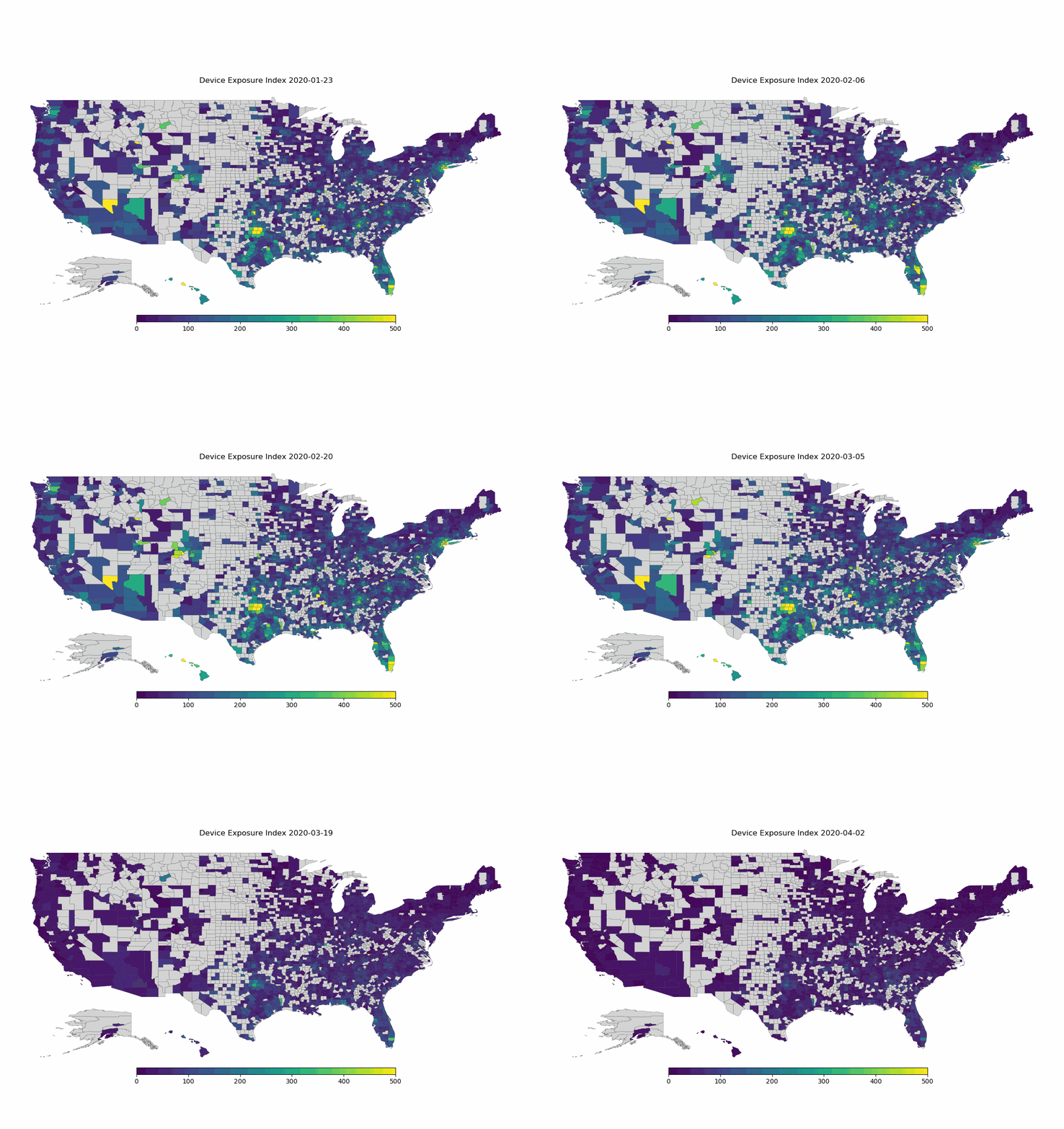
An application of the data is shown below. This animated time-lapse map from January 23 to April 2 shows how people’s movements dropped much more quickly in some areas than in others, such as in the South and Southeast of the United States. This is represented by color changes from yellow to green to dark purple as the average device exposure within a county went down.

The data can’t tell researchers how well people are practicing social distancing at any given location, and therefore their specific risk of catching the coronavirus. But it can start to reveal how successful various policies—such as states of emergencies and shelter-in-place orders—have been. “When you prescribe rules of movement, when you tighten them, and when you relax them—you can correlate that with what people are actually doing and which groups and areas are reducing their exposure,” says Couture.
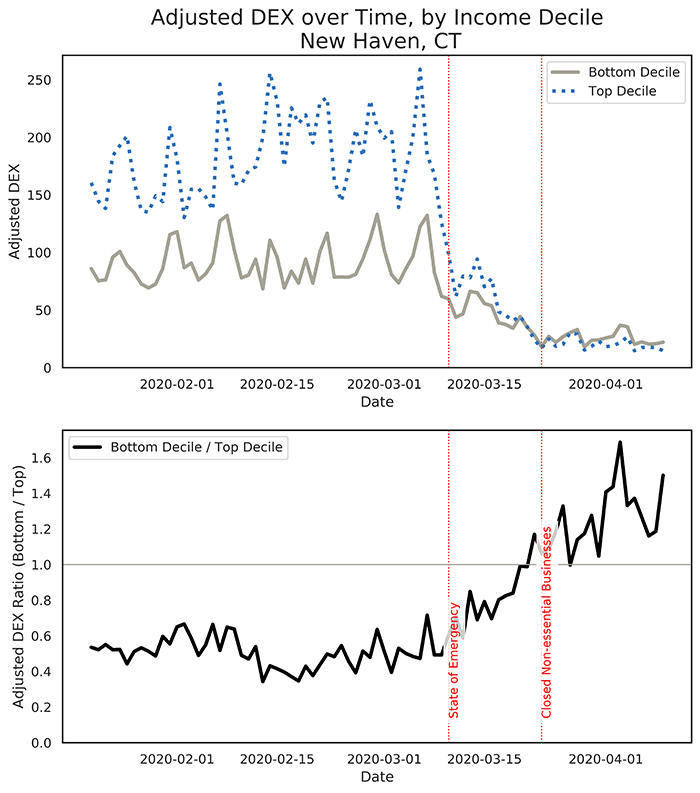
“It often looks like people start to reduce their exposure when a state of emergency is declared, but when the actual shelter in place order comes in, it has less impact on movement,” says Couture. An example is the analysis charted below for New Haven-Milford, Connecticut, which showed that the announcement of the state of emergency itself appeared to be a powerful mechanism that convinced people to reduce their movements, and hence their exposure, to the virus.
The exposure indices Couture and colleagues have compiled also include demographic information that can show which groups are at greater risk for exposure, such as minorities and low-income people. Exposure levels vary over time: The top chart in the set below shows that people living in New Haven, Connecticut neighborhoods with median incomes in the top 10% initially had higher exposure rates than those in the bottom 10%. After a state of emergency was declared, exposure levels in high-income neighborhoods declined much faster than in low-income neighborhoods. This may be because lower income people are more likely to work on the front lines in essential business, and have less ability to reduce their exposure than those who can afford to shelter at home.
The bottom panel shows the ratio of the device exposure index (DEX) for people living in neighborhoods with median income levels in the bottom 10% relative to those in the top 10%. A value higher than 1 signals that exposure is higher in low-income than in high-income neighborhoods

These patterns could prove helpful in showing which locations and demographics have the potential for greater exposure under different types of orders when policies have been gradually lifted.
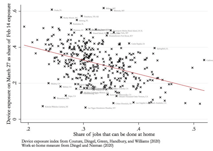
As another example, the graphic below shows that metropolitan areas with more jobs that can be done from home had larger reductions in potential exposure to the coronavirus. Again, this correlation suggests that who works from home depends on who can afford to do so while remaining gainfully employed.

Eventually, the explosion of location data has the potential to tease out even deeper stories explaining not just the hidden patterns behind our unique location in the world, but also the unexpected things that larger groups and types of places share in common. “One of the things we want to encourage is careful work to identify the causations behind these correlations,” says Couture.
The Covid-19 Exposure Indices were created by Jonathan Dingel of the University of Chicago’s Booth School of Business, Kevin Williams of the Yale School of Management, Jessie Handbury of the Unviersity of Pennsyania’s Wharton School of Business, Allison Green of Princeton University, and Victor Couture at Berkeley Haas.
Posted in:
Topics:


