How maps can inform or mislead
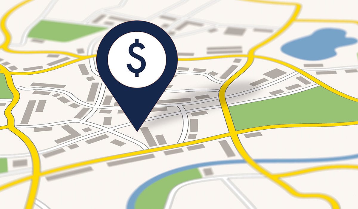
Maps shape economic outcomes. Flood insurance pricing, for example, depends on flood risk maps, which have been proven inaccurate in some states.
Explicitly or implicitly, mapmakers have an agenda, says Haas Asst. Prof. Abhishek Nagaraj. Understanding those agendas is crucial to using maps responsibly.
When the coronavirus hit, numerous maps plotted the disease’s spread. But they weren’t always telling the whole story, which affected decisions such as where to focus assistance.
When interpreting maps, Nagaraj—whose research focuses on the economics of maps—suggests asking the following three questions.
Has the data been adjusted?
A map showing absolute numbers of coronavirus infections inherently highlights heavily populated areas. Adjusting for population size, with a unit such as “cases per 100,000 people,” gives a more accurate view.
What’s the bias in the data?
Coronavirus maps showing drastic changes in movement patterns as nonessential travel halted may have been inherently biased. Low-income people who live farther from work or a grocery store may need to travel greater distances than higher-income people who can comfortably shelter and work at home. Data may also miss individuals not officially on payrolls. “Maps can simplify a lot of complicated stories,” says Nagaraj, “and aid measures might miss people if governments rely exclusively on data that does not record them.”
How detailed is the data?
Plotting coronavirus cases in relatively large geographic units, such as countries, states, and counties, can lead to overgeneralizations and even mischaracterizations of trends. Plotting smaller geographic units can elicit greater insight. In NYC, zip-code-level info showed that the poorest neighborhoods had much higher rates of infection.
Understanding a Mapmaker’s Agenda
Google Maps, Apple Maps, Yelp, and OpenStreetMap each chart the world in different ways, leading to profound economic implications for those literally put on, or left off, the map.
Economic Context
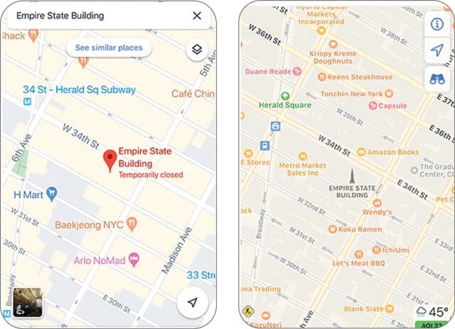
A comparison of the area around the Empire State Building in NYC. Google (left) skews toward roads and transit, possibly owing to its tight integration with Uber and Lyft apps, while Apple favors more of the shops and landmarks that its affluent users want.
Details Matter
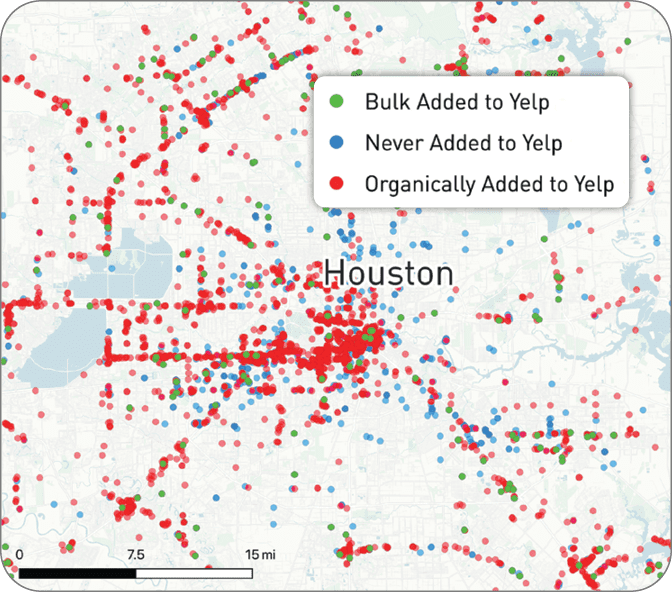
Yelp can inadvertently leave as many as 40% of businesses off its map, often due to their small size or rural location, which can lower restaurant revenues for those missed by as much as 12%.
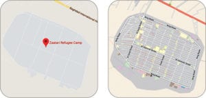
Correcting Bias
OpenStreetMap (right, showing a location in Jordan) excels at open-source projects like mapping refugee camps, which maps like Google (left) may miss.