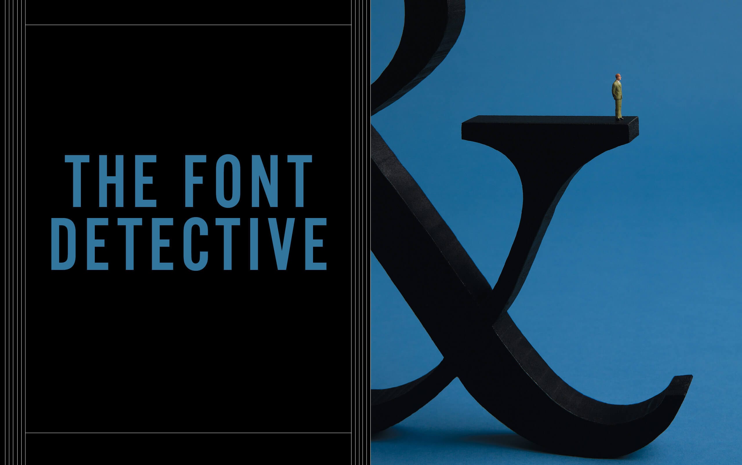
Thomas Phinney, MBA 03, uncovers forgeries and solves modern-day crimes
Thomas Phinney was working as the product manager in Adobe Systems’ fonts group when his team received a request from an attorney about a suspected will forgery. The lawyer wondered whether the fonts in which the disputed document was typed might provide a clue. “I was the only one in the group to say, ‘Hey, that sounds cool!’” says Phinney.
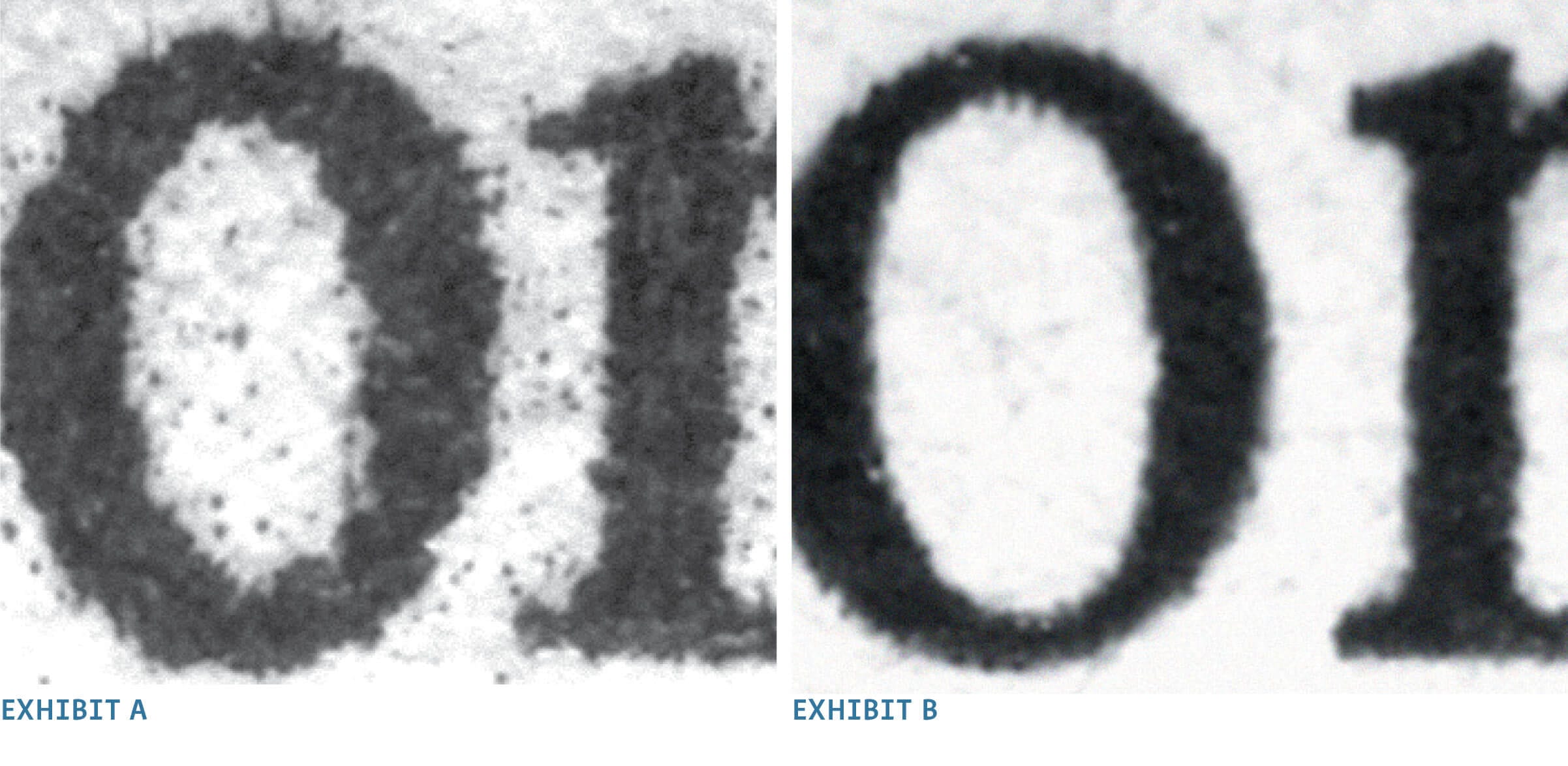
Using a digital microscope and counting individual pixels, Phinney noticed speckles of stray ink around each letter and “wicking,” or bleeding, of ink along the paper fibers. He deduced that the document had been printed on an early inkjet printer at 300 dots per inch (dpi). “There was one small problem,” says Phinney. “That type of printer didn’t exist in 1983,” the year the document was purportedly written. The Case of the Wicked Will, as Phinney calls it—he affectionately names all of his investigations—was cracked.
Phinney’s fascination with all things fonts and typography have led him to become the world’s foremost forensic font expert, capable of dating and identifying fonts and the technology used to print them. He’s been an expert witness for numerous court cases and evaluated questioned documents for the U.S. Treasury, The Washington Post, the BBC, the PBS television show History Detectives, and more. He also consults for the likes of Microsoft and Google. Whether uncovering forgeries, verifying font sizes against mandated legal requirements, or a host of related typography conundrums, Font Detective Phinney relishes his work at the intersection of art, commerce, history, and technology.
Why typography matters
For a field with roots in Gutenberg’s printing press, fonts remain at the bleeding edge of our digital world. Digital typography underpins virtually every page with which we interact online. And yet, Phinney often finds himself defending why it all matters. Branding, for one thing, he says. “The selection of typefaces and the arrangement of them can be as important as the use of color, images, or abstract graphics in creating a brand,” Phinney wrote in Communication Arts magazine.
Psychological research has also shown that even subtle differences in typography, such as using small caps and old-style figures, can affect a reader’s mood (as indicated by use of the corrugator muscle in the forehead to frown) as well as one’s performance on creative cognitive tasks after reading.
Type design, a craft that blends art and science, is like fashion or furniture, says Phinney, himself a type designer. “While true innovation is rare, people consistently come up with variations on existing themes or combine existing elements in new ways.”
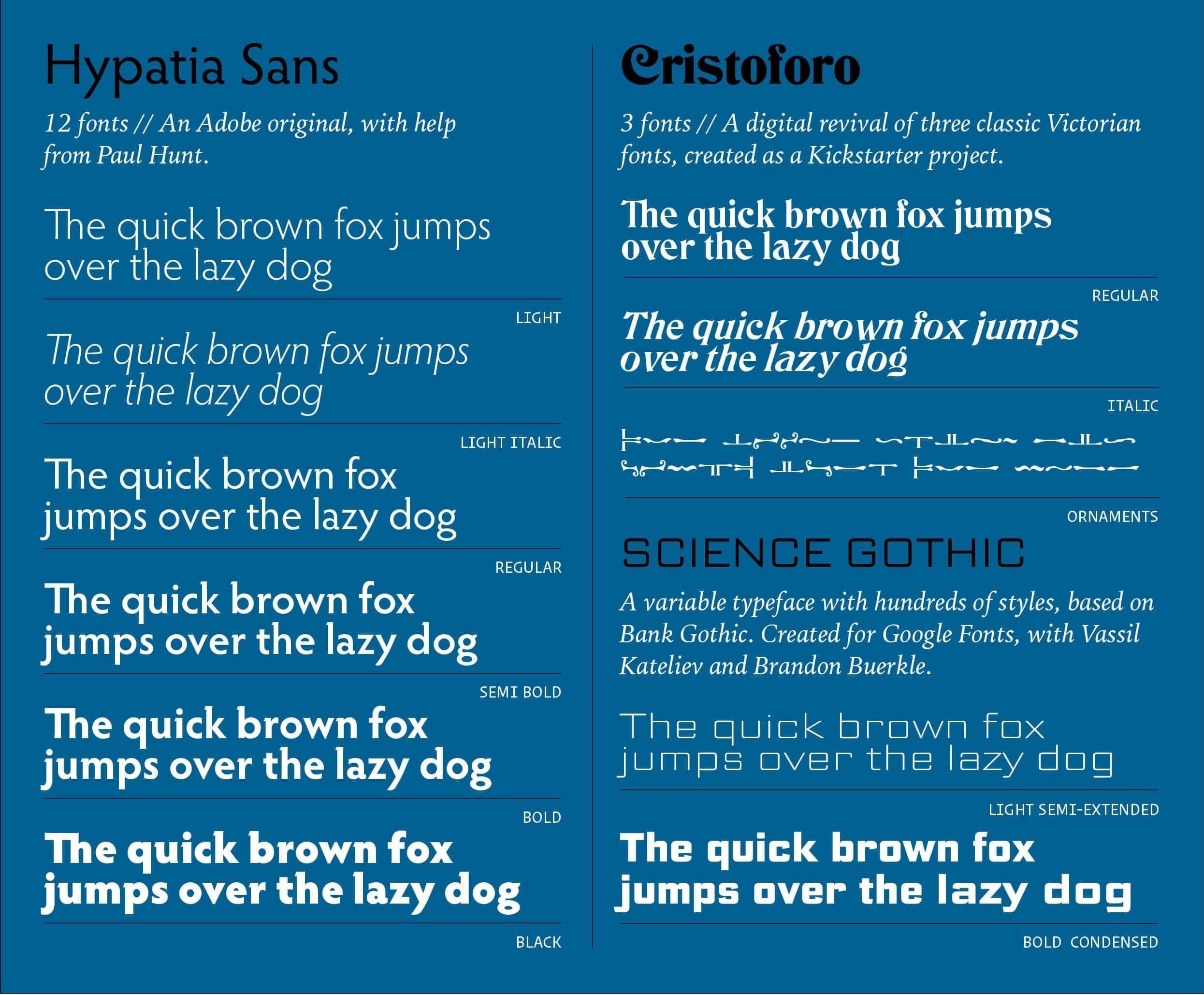
He points to the ScienceGothic.com site, which displays an open-source, dynamic typeface he’s been working on with funding from Google. Users can quickly change the weight, width, contrast, and slant of the font to achieve different-looking results, all while still staying within the Science Gothic family—something that would require 200+ fonts to achieve using traditional methods. “It’s proof that there’s still so much new you can do with fonts,” says Phinney.
Turning up the ‘intellectual simmer’
Phinney earned undergraduate degrees in psychology and political science at the University of Alberta in Canada, where he grew up, then a master’s in graphic arts publishing with a specialization in design and typography at the Rochester Institute of Technology. He then began an 11-year career with Adobe Systems in Silicon Valley.
It was during his Adobe stint that he decided to pursue his Berkeley MBA via the evening and weekend program. Phinney was attracted to the school’s reputation and quality. “The level of intellectual simmer at Haas was really lovely,” he says. “People’s brains were always working to come up with new ideas and to challenge each other, and I liked being in an academic environment operating on that level.”
Earning an MBA might not have been the most obvious career path, Phinney says, but he used his Haas training to move up the product management chain at Adobe and later at font management software company Extensis in Portland, Oregon, where he currently lives. In 2014, Phinney joined FontLab, a creator of apps for type design and font creation, as VP, later becoming CEO.
While crediting a Haas course in negotiation as being particularly helpful in progressing through the management ranks, it was a class in managing technology-related businesses taught by Professor Emeritus Hal Varian that Phinney recalls as a game changer for his career.
The selection of typefaces and the arrangement of them can be as important as the use of color, images, or abstract graphics in creating a brand.
“That one class gave me fundamental tools and new ways of thinking about interconnected ideas that all played into my day job, like substitutability of goods and zero marginal cost for digital goods—including fonts,” says Phinney. “They’re essentially a weird form of mass-produced software.”
Driving demand for detective work
But even as his day jobs kept him busy, Phinney continued getting called to the work that had long fascinated him: unlocking the mysteries held by fonts and typography. Throughout his corporate work years, “Cases just kept popping up,” he says, with word of mouth driving font forensic questions to his personal inbox.
One such case involved a rabbi who had faked his credentials to land a job. A family in his congregation turned to Phinney to validate details of the man’s graduation certificate, or smichah. The rabbi had taken steps to make it harder to detect, degrading the quality of the document by providing only a faxed copy, not the original. But the deception couldn’t elude the font detective. “The document was dated 1968, but the font in which his name was printed didn’t exist until 1992,” Phinney says. And so ended The Case of the Reprehensible Rabbi.
By 2018, Phinney decided to make his side gig official. “I was having so much fun with this work,” he says. “I also realized that it wasn’t a trivial amount of money I could earn through these cases, especially if I took the time to publicize it in a formal way.” Just two years after hanging out his virtual shingle as The Font Detective, Phinney earns as much as half his revenue from font forensics; the remainder comes from designing fonts for clients like Google.
The bad, the inadvertent, and the illegibly small
Phinney says that most forensic cases fall into one of two categories. The “nefarious” cases are those like the man who sought to prevent his wife from getting her fair share of assets in their divorce by forging debt documents, to bamboozle her into accepting a lower valuation of their communal property. Unfortunately for the soon-to-be ex-husband in Phinney’s Case of the Dastardly Divorce, those faked documents were not only printed on a 600 dpi printer that didn’t exist at the time they were dated but were created in a font that wouldn’t have been available either. “That case was slam-dunk easy,” says Phinney.
The other type of case Phinney commonly handles involves determining if documents meet typographical legal requirements, like whether what Phinney terms “the stupidly tiny” 5-point typography on Justin Timberlake’s CD liner notes were sufficient to stand as public notification of others’ copyrights on the album. (Phinney suggested not. The case was settled out of court.)
Even for organizations trying to be good font citizens, it can be challenging. “I feel for corporations, because legal typography requirements can differ in every state,” Phinney says. California, for instance, requires information on prescription labels to be printed in at least a 12-point font, while that may not be the case in other jurisdictions. In New York, legal requirements for both font point size and height work a bit differently than those of any other state. “Which is just another reason a lawyer might need to consult an expert,” notes Phinney.
The perfect case
Phinney’s dream case is “one that has major implications of some sort and exposes malfeasance that affects a lot of people.” He had a close brush back in 2004, when he was asked by journalists to examine memos related to President George W. Bush’s service in the Texas Air National Guard that seemed to prove that Bush had disobeyed orders and received outside help in cleaning up his military record. “Based on my research I could not support a conclusion that they were authentic—quite the contrary,” says Phinney, speaking of the high-profile case that ended with a public repudiation of the journalists who ran with the story without authenticating the forged documents first. So the hunt for the perfect case continues.
Reflecting on his career, Phinney has a message for anyone thinking of making a mid-career switch to a vocation that has been tugging at them.
“I could have been embarrassed or ashamed to switch paths out of my corporate management career to something that, on the surface, wouldn’t draw so broadly on my MBA training,” he says. “But I’m really glad I didn’t let those feelings deter me from doing what I wanted to do. Because I’m still making money but having way more fun!”